Using Colour Psychology & Theory as a Tool for Interior Design

August 26, 2025 // Emily Wallace // FW Decor
Colour is a very important tool that interior designers use; it is a staple in every project, no matter the type. While you might think that selecting things like wall paint or fabric swatches is a simple task, there is actually a lot to think about. Colour has psychological effects on our minds and can drastically change how we see, act, and feel in a space. Colour theory is a device that can be used alongside psychology to help elevate a space.
As already stated, colour dominates how we perceive the world, which makes it a very powerful design tool. This is because colour can elicit an emotional response, suggest the mood, depth, and function of a space, and help us perceive a space. When looking at colour psychology, every colour and/or group of colours is automatically associated with certain emotions. Although certain cultures and religions may have their own colour associations, these are general emotions associated with basic colours.
Red is a bold, intense, and energetic colour commonly associated with power and desire, but also aggression.
Blue is known to be calm and tranquil, reflecting the sky and the ocean. It is also seen as a professional colour.
Yellow and orange provide warmth, energy, happiness, and attention.
Green reflects nature, growth, life, and balance.
Purple is luxe, refined, and sophisticated.
White is pure and innocent, while Black is powerful and sophisticated.
Keeping this in mind when designing helps to create a space where people can feel good and successfully use a space for its intended purpose. For example, when choosing colours for a bedroom, you would choose blue or green over red, yellow, and orange, as they are calming colours that would help relax you, as opposed to grabbing your attention and energizing you.
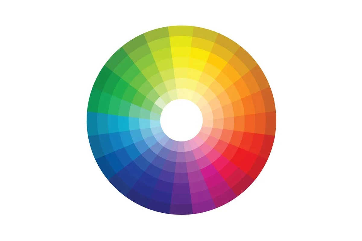
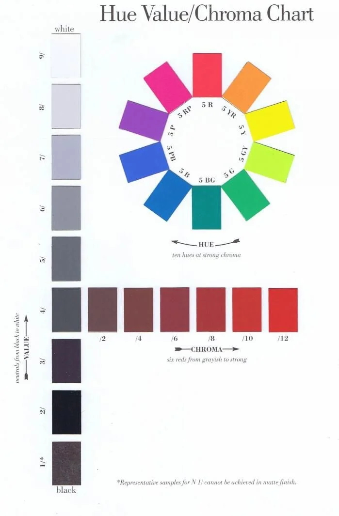
There are other things to keep in mind when deciding on colour schemes, and you can use colour theory to help. Colours come in a wide variety of shades, hues, values, tints, tones, and chroma. Changing a colour from light to dark or from vibrant to pale may change the original effect it gave off, which is important to consider. The human eye gravitates towards different values and contrasts; so, utilizing colours with contrasting shades, hues, values, tints, tones, or chroma creates a more visually interesting space.
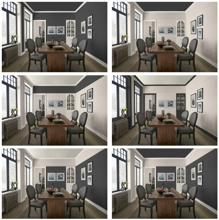
Another thing to consider is the proportion and scale of your colours. Depending on the types of colours you choose and the ratio of them in a space, you can actually change your perception of the space's shape and size. For example, using a dark colour on the ceiling can make it feel lower than it actually is.
Colour harmonies are also used to change the look of a space. By choosing a colour harmony, you can decide how you want colours to reflect off each other, which can radically change how a space is perceived. There are seven different colour harmonies:
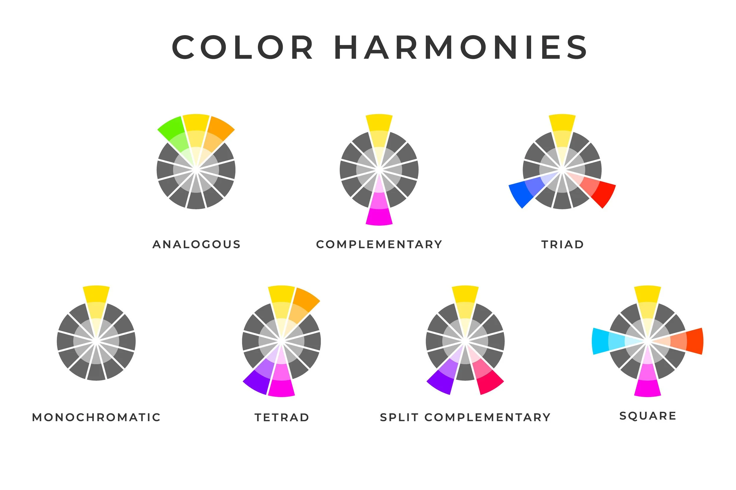
Monochromatic - only one hue
Complementary - opposite to each other on a colour wheel
Split Complementary - chosen colour and the two colours adjacent to its complementary colour
Analogous - chosen colour and the two adjacent colours next to it
Triad - three colours evenly spaced around the colour wheel (creates a triangle)
Tetrad - four colours that are two pairs of complementary colours (creates a rectangle)
Square - Four colours equally spaced around the colour wheel
By using colour psychology and theory in interior design, you can transform a space to not only look more interesting but also physically feel better.
Sources:
https://www.swatchbox.com/blog/The-Psychology-of-Color-in-Interior-Design
Image Credits:
https://www.peppertheapp.com/blog/colors-in-food-photography
https://evstudio.com/the-hue-circle-its-awesome-like-the-color-wheel/
https://www.behr.com/colorfullybehr/how-paint-color-changes-room-perspective-colorfully-behr/